Morfos
Work Scope
Identity, Typeface
Sector
Manufacturing
Client
Morfos
Identity, Typeface
Sector
Manufacturing
Client
Morfos
Design
Jumyoung Lee
Jumyoung Lee
Morfos is a Korean high-end memory foam mattress brand.
Named after Morpheus, the god responsible for dreams in Greek mythology, the brand name contains a brand vision that hopes customers who use Morphos' products will travel into their dreams every night.
From the logo, typography, and iconography, I developed a brand system for Morfos to maintain a consistent and sustainable look and feel.
모르포스는 한국의 하이엔드 메모리 폼 매트리스 브랜드입니다.
그리스 로마 신화 속 꿈을 담당하는 신, 모르페우스(Morpheus)에서 따온 브랜드명은 모르포스의 제품을 사용하는 고객이 매일 밤 꿈 속으로의 여행을 떠나길 바라는 브랜드 비전이 담겨있습니다.
로고부터, 타이포그래피, 아이콘그래피까지 Morfos의 일관되고 지속 가능한 Look & Feel을 유지하기 위한 브랜드 시스템을 개발했습니다.
Logo
Morfos’s logo consists of wing-shaped symbol and logotype.
The wing-shaped symbol in the silhouette of M(brand initial) symbolizes Morpheus, the god of dreams. The logotype set in bespoke font, Morfos Regular, captures the delicate curves of the symbol and the characteristics of rounded strokes.
브랜드명의 이니셜인 M의 실루엣을 가진 로고마크는 꿈의 신 모르페우스를 상징하는 심벌인 날개 모양으로 디자인되었습니다. 비스포크 폰트, Morfos Regular를 사용한 로고타입은 심벌의 섬세한 곡선과 라운드 처리된 획의 특성을 그대로 담았습니다.

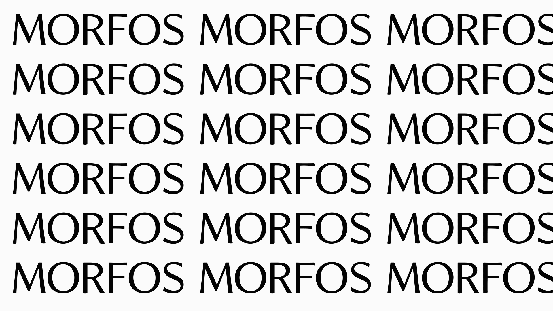
Typeface
Morfos Typeface is bespoke typeface designed for Morfos. With Sans-serif skeleton, every terminal of letterforms were carefully carved for the visual harmonization with the symbol.
Morfos Typeface는 모르포스를 위해 설계된 전용 서체입니다. 산세리프 골격을 기반으로, 심볼과의 시각적 조화를 위해 각 글자의 단자들이 섬세하게 조각되었습니다.


Product Pattern
Each product of Morfos has a unique pattern inspired by the islands that appear in Greek mythology. Each pattern was designed to have its own individuality while maintaining the visual consistency of a smooth curve.
모르포스의 각 제품은 그리스 신화속 등장하는 섬들에 영감받은 고유한 패턴을 가지고 있습니다. 각 패턴들은 부드러운 곡선의 시각적 일관성을 유지하면서도 각각의 개성을 가질 수 있도록 디자인했습니다.
모르포스의 각 제품은 그리스 신화속 등장하는 섬들에 영감받은 고유한 패턴을 가지고 있습니다. 각 패턴들은 부드러운 곡선의 시각적 일관성을 유지하면서도 각각의 개성을 가질 수 있도록 디자인했습니다.